Fights2C
Creating an interface for a platform to promote fighters and martial arts gyms
- Client: Elogroup
- Role: UX/UI Designer

Context
Fights2C was a project of a platform for Fighters, Gyms and people who like to watch fights from many styles (MMA, Brazilian Jiu-Jitsu, Muay Thai and others).
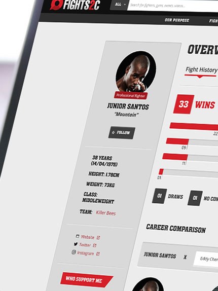
I was the Designer responsible for the product's UX and UI. I worked together with a PO and 2 Developers on the MVP for this social network.
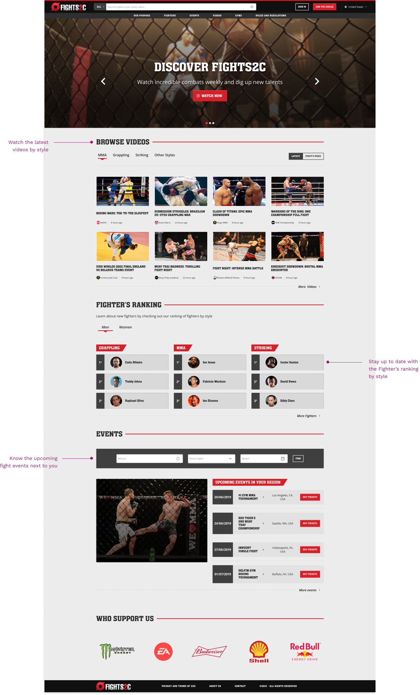
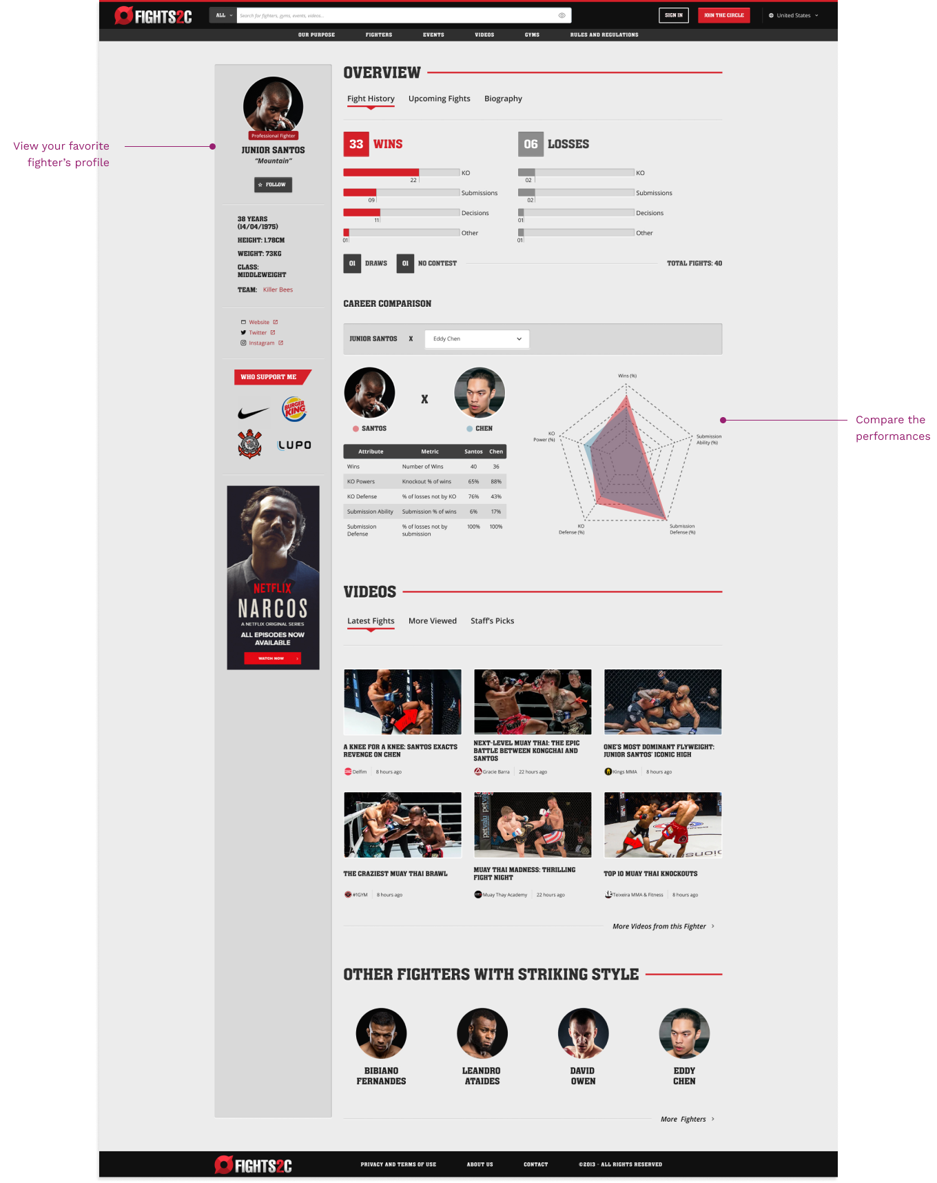
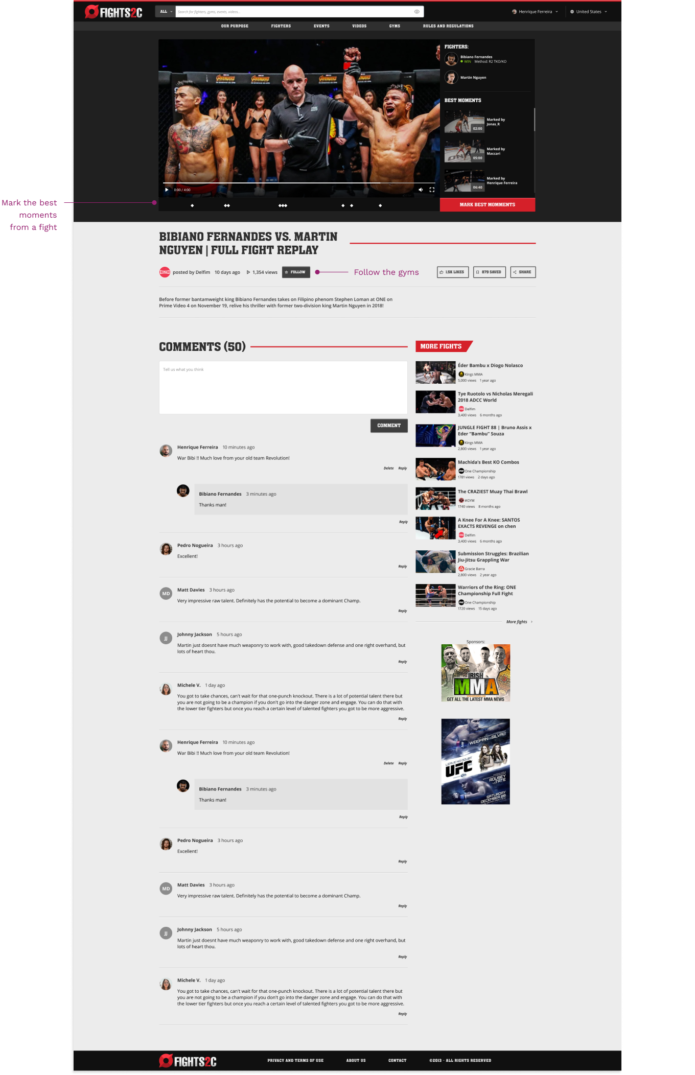
My goal was to design the interface for the web platform.
I cooperated in research, inteviewing users and stakeholders to understand their needs, defined the information architecture and the visual design of the interface.
Constraints
- Money: Tight budget
- Time: Quick time frame
Accomplishments
As it was at MVP phase, we could validate some assumptions that we had and test the market to learn and make improvements.
Understanding the needs
Before starting anything, the team had to understand the needs, both from the side of the potential users as well as from the business. Together with the Product Owner of the project, I visited some gyms to see their context and interviewed Fighters and Gym Owners.
Some Insights:
- 💸 Many small gyms don't have budget to promote their services and their athletes.
- 🥋 Athletes feel hard to get more visibility and, therefore, find a sponsor.
Working on the information hierarchy and navigation
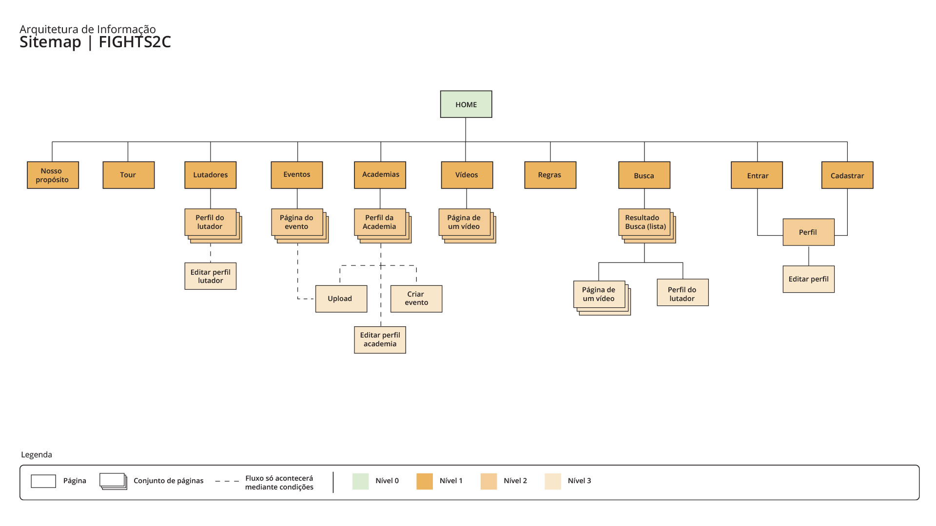
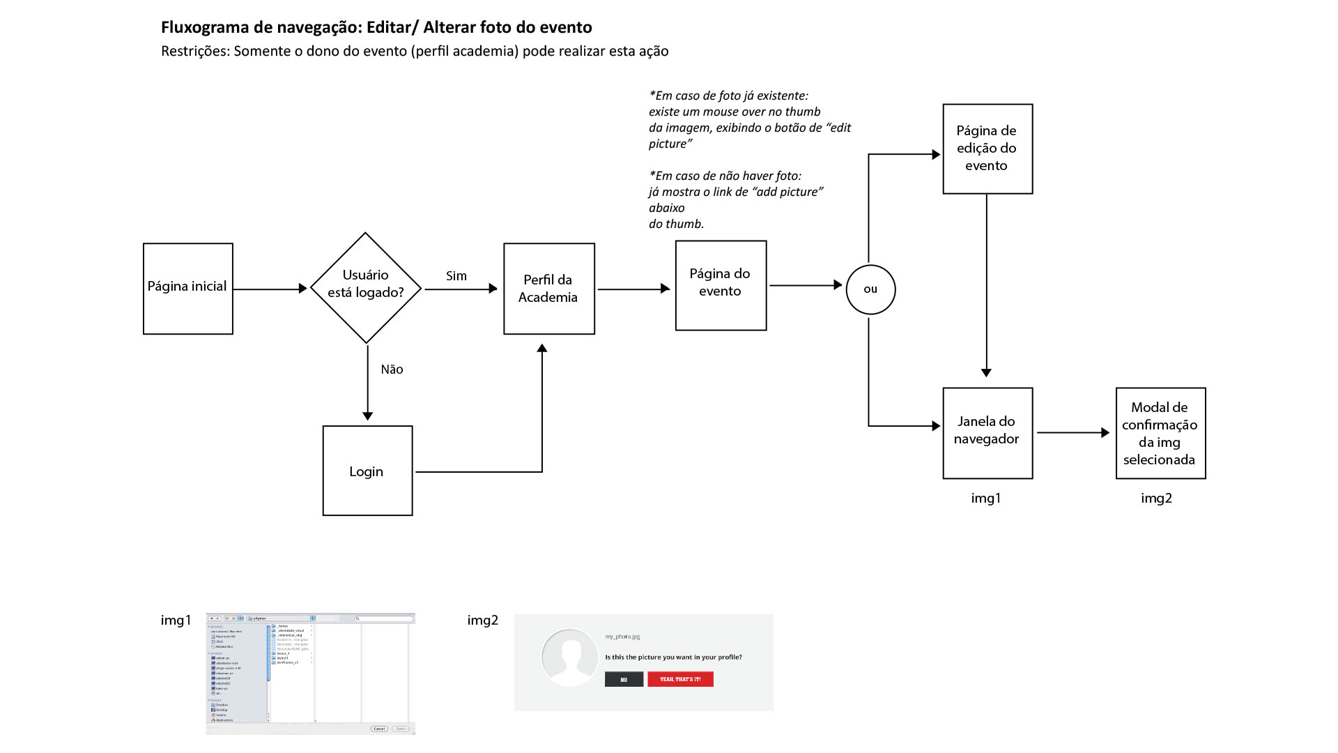
We structured the hierarchy of the pages and the navigation flow, delivering sitemap and flowcharts. This helped to align the ideas between the team and the stakeholders about the organization of the content and how users could navigate through it. After some meetings, as it was an MVP, the stakeholders decided to start with fewer pages at the beginning and then release more content.
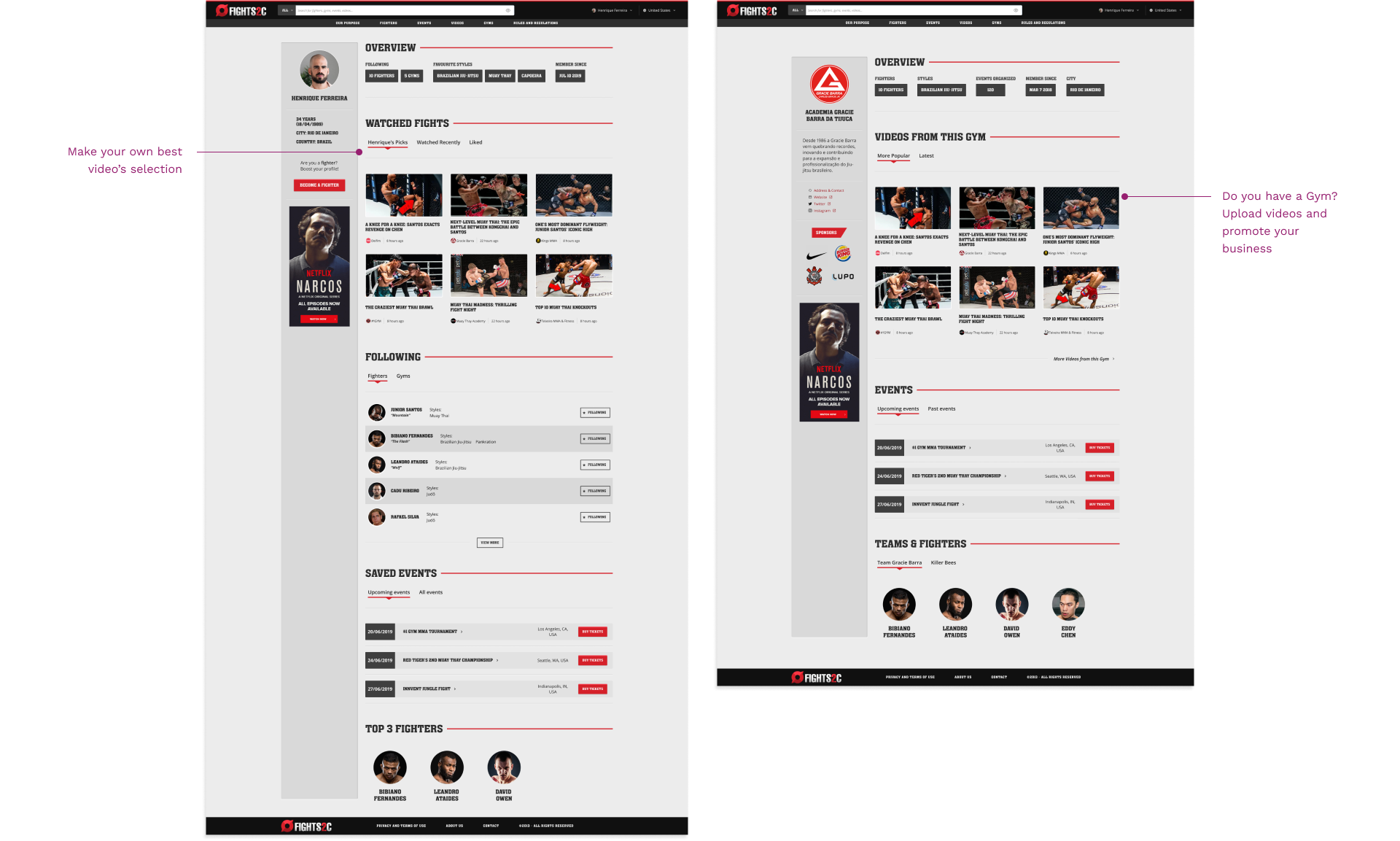
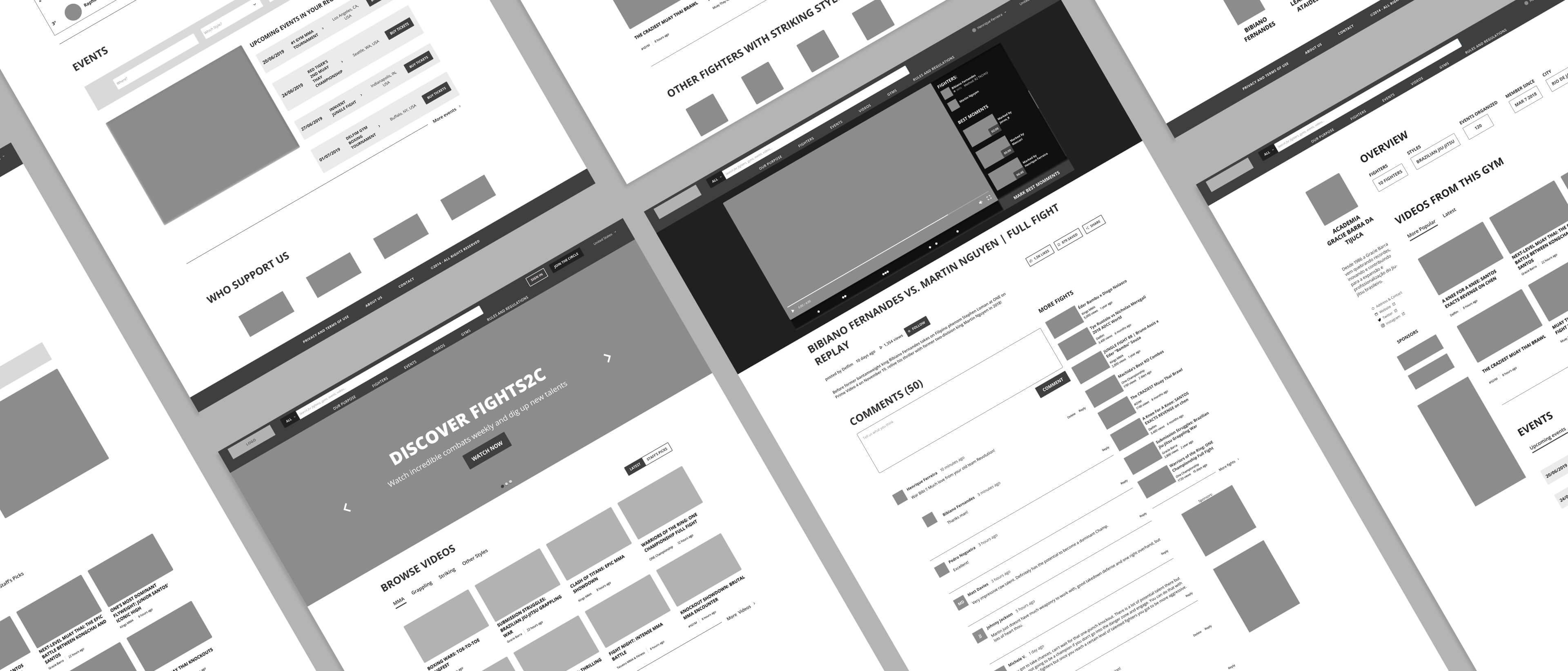
Then, we went with some wireframes to validate information organization in the interface.
Defining the Visual Design
The stakeholders came up with product's name and asked for a visual identity and a logo, which should have some attibutes: strong, modern, minimalist and reliable. I started with some visual research for images that could convey those attributes.
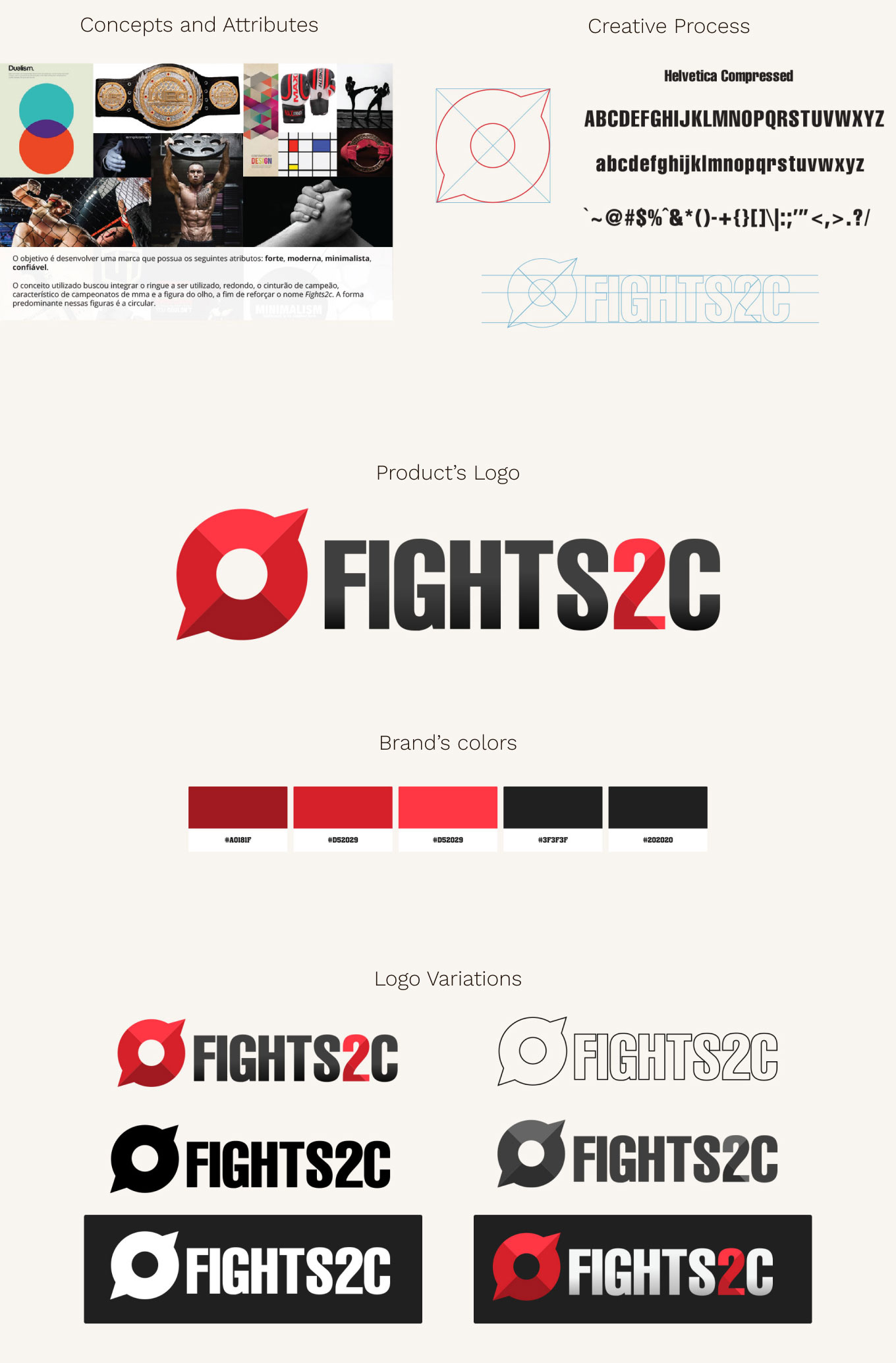
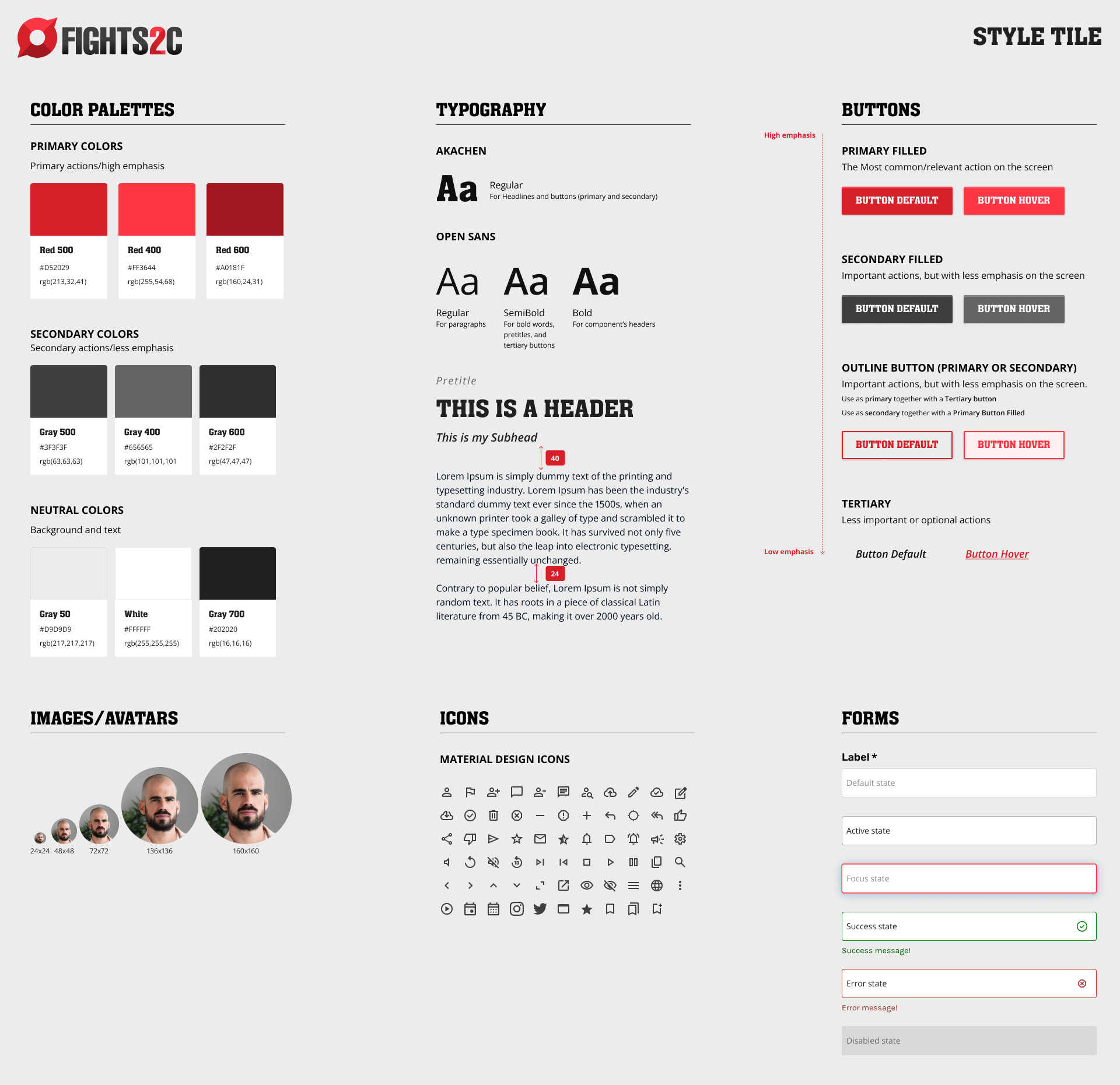
After the visual identity was approved, I started working on the visual of the interface. Here I decided which typography I would use, how I would apply the color palette on the UI elements, button appearance, iconography, borders, images sizes, and so on. I synthetized them on a Style Tile document to guide myself, as well as the developers who were implementing the system.
