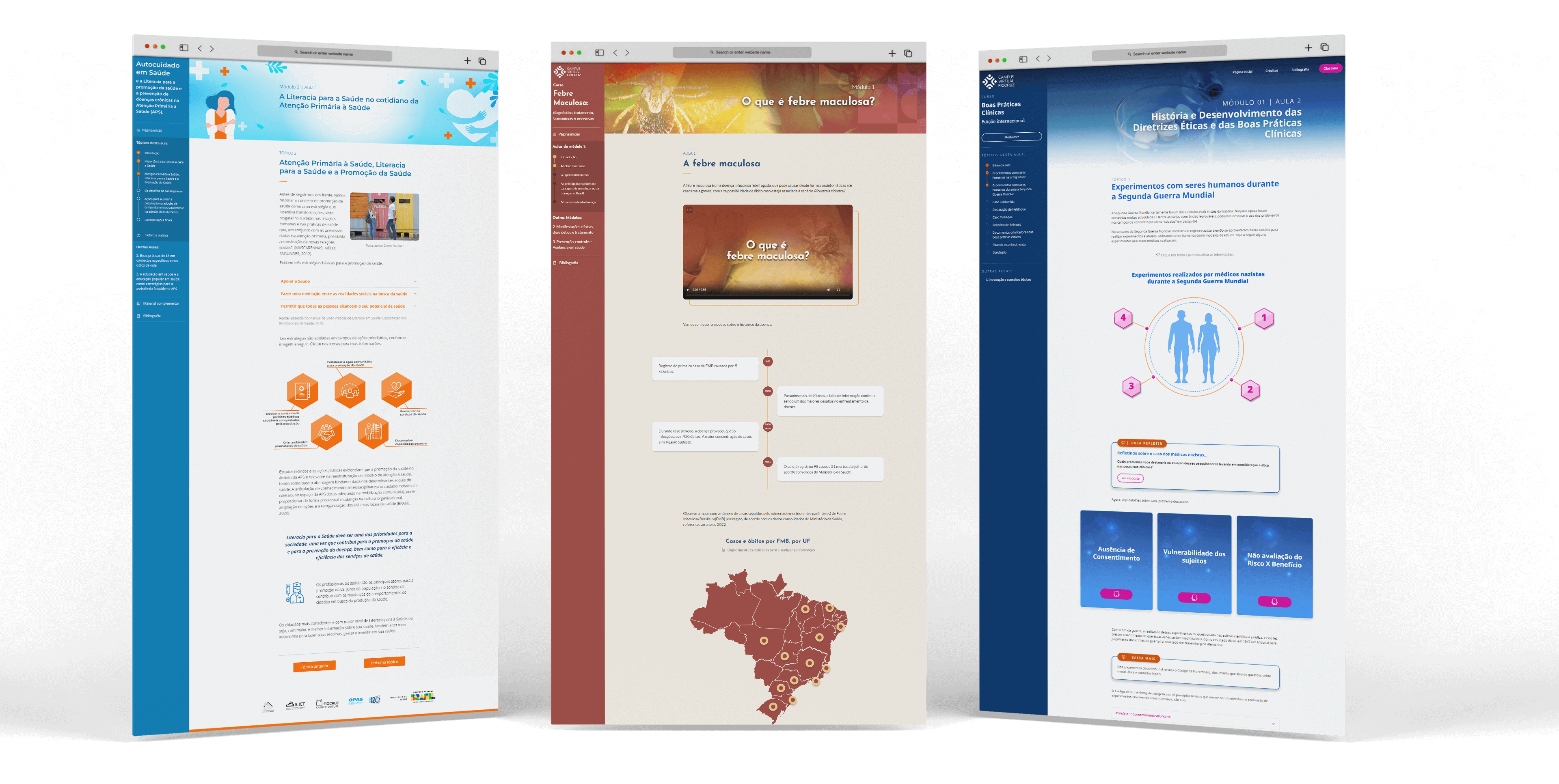
Fiocruz Virtual Campus
Building responsive interfaces and a Design System for e-learning projects at one of Latin America's most renowned public health institutes
- Client: Fiocruz
- Role: Product Designer

Context
The Fiocruz Virtual Campus (FVC) is a public educational platform that provides open courses on a large scale and educational resources in the health area to graduate students, teachers, healthcare professionals, and the general public.
For this project, I worked in a team with 3 designers and 1 instructional designer.
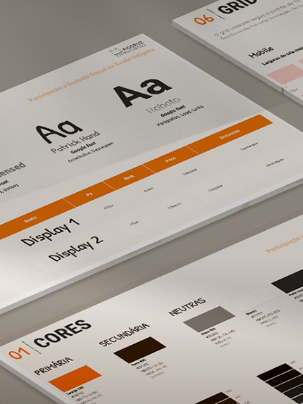
My mission was to build a template interface for the upcoming courses and start a Design System to guide the teams.
I defined the Information Architecture, organized and documented the UI in a Design System and implemented the content from the courses in HTML/CSS/JS.
Constraints
- Culture: Low UX maturity & Bureaucracy
- Time management: Delays in a tight schedule
- People: Lack of skilled professionals in some areas to meet the demand
Accomplishments
- Tailored the educational content displayed, reducing information density on the screen;
- Kept consistency throughout the courses and improved the team's work process.
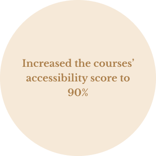
- Increased the courses' accessibility score to 90%.

Starting out the project
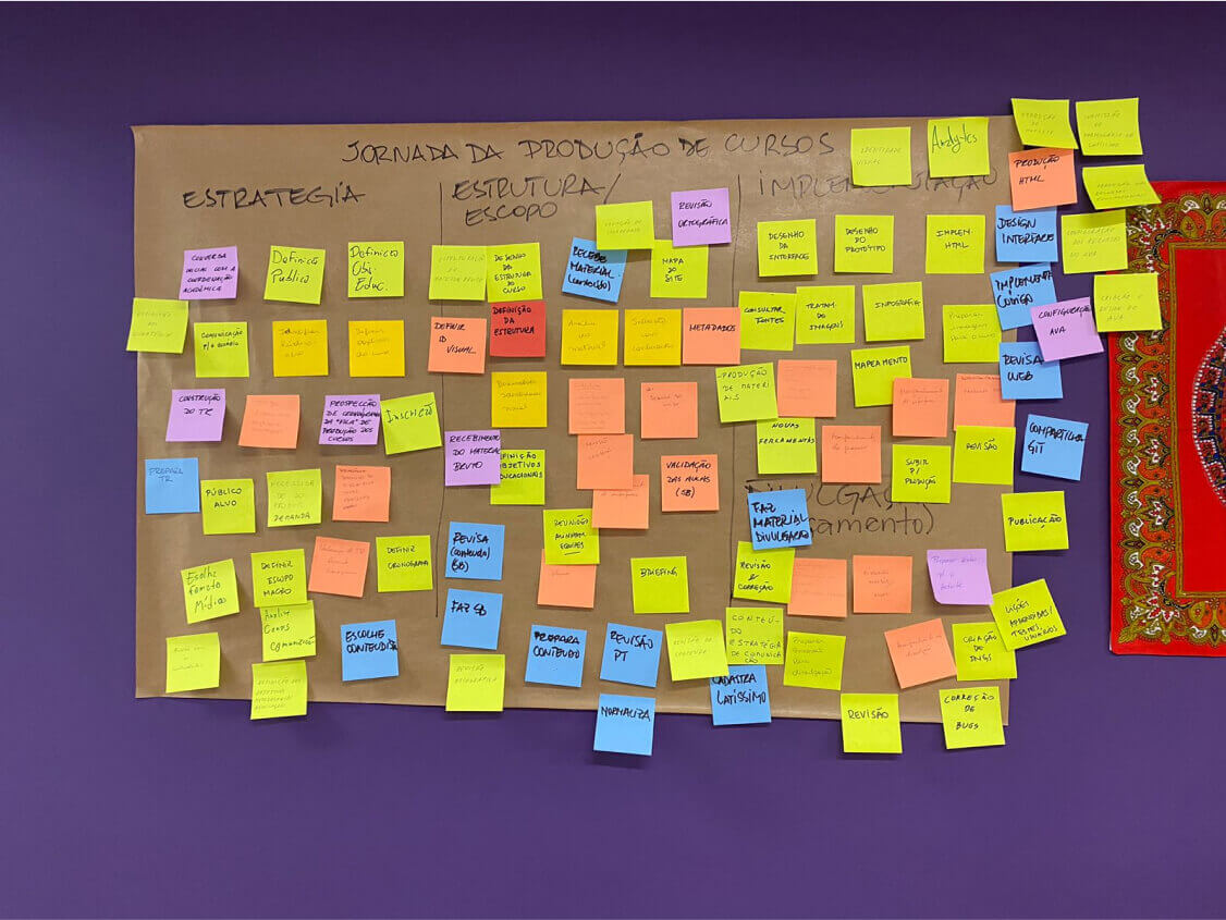
We began talking with stakeholders - coordinators, instructional designers, and developers - to understand better the process of producing an online course in FVC. Basically, the process has 5 major steps divided into 4 groups:

After a 1st approach with the stakeholders, it was clear the need of organizing the house. They pointed out what they expected with this project and I organized a research to understand more the context and frame better the problem: desktop research, user research (remote interviews and online questionnaires), and workshop with stakeholders. These activities generated some documents, which were shared with the teams to put everybody on the same page:
Some Insights:
- ❌ Most of the course’s content in competitors was presented in video format. However, it’s not the reality at this time of FVC, which doesn't have enough motion professionals and infrastructure to work on video production for attending to all the demands.
- 🧐 Content varies, but the majority had strong academic writing. If the delivering was delayed, impacted in all process.
- 📄️️ Instructional designers didn't have a standardized set of resources to work with - nomenclatures or even a variety of components - leading to misunderstandings or “PowerPoint-looking” proposals for the courses.
Defining the course's template's Information Architecture
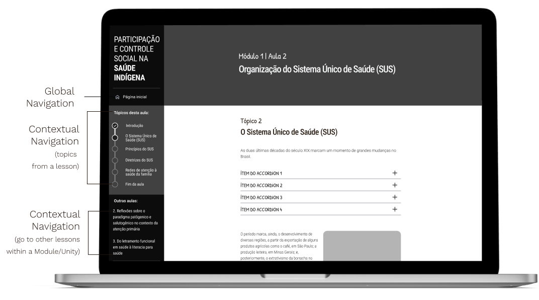
The courses have one initial page, giving an overall about their goals & lessons, and the internal page, with the educational content.
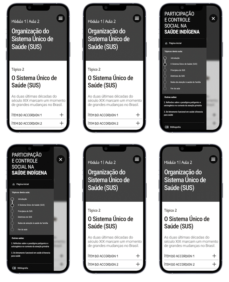
The proposal for the internal page was to use a 2-column layout with 3 areas: sidebar on the left, hero area on the top, main content area. We chose to use a visible sidebar because we wanted to make sure the user could always see his/her/their location and progress throughout the lesson.
Applying UI components to educational context
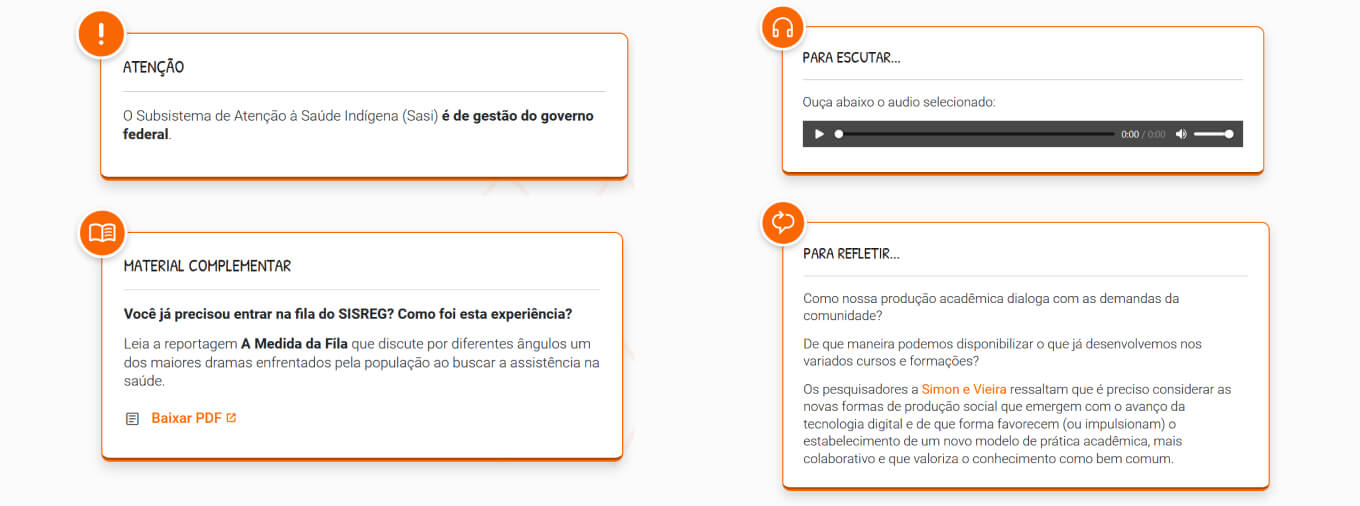
For choosing what UI components are worth using along the content to meet educational needs, we listed with the instructional designers some resources and the goals expected with them. We designed a set of components - interactive and non-interactive - for different goals:
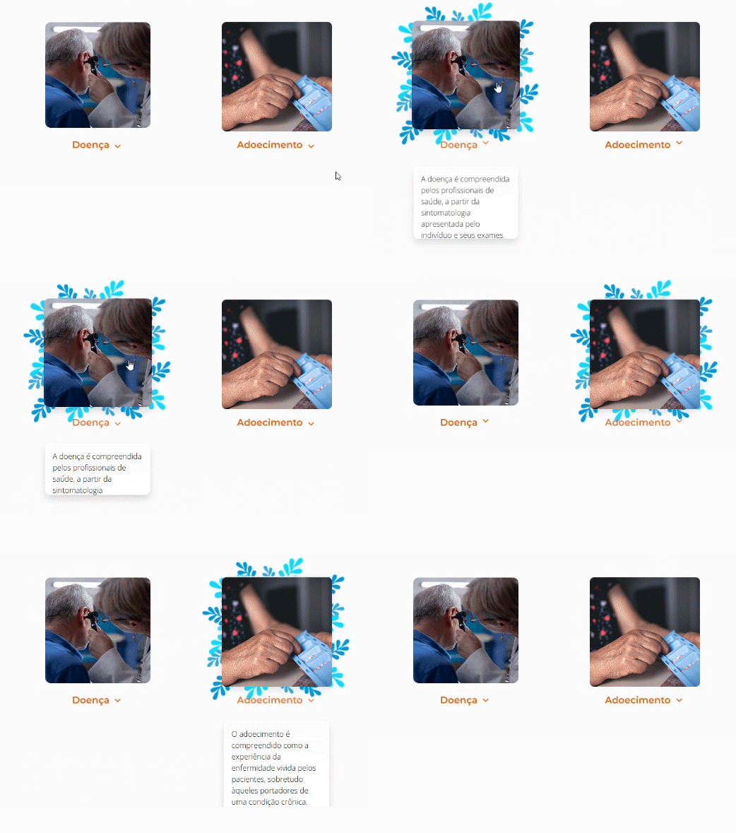
- 👀 Attract user's attention for some content - cards, background parallax, text highlights...
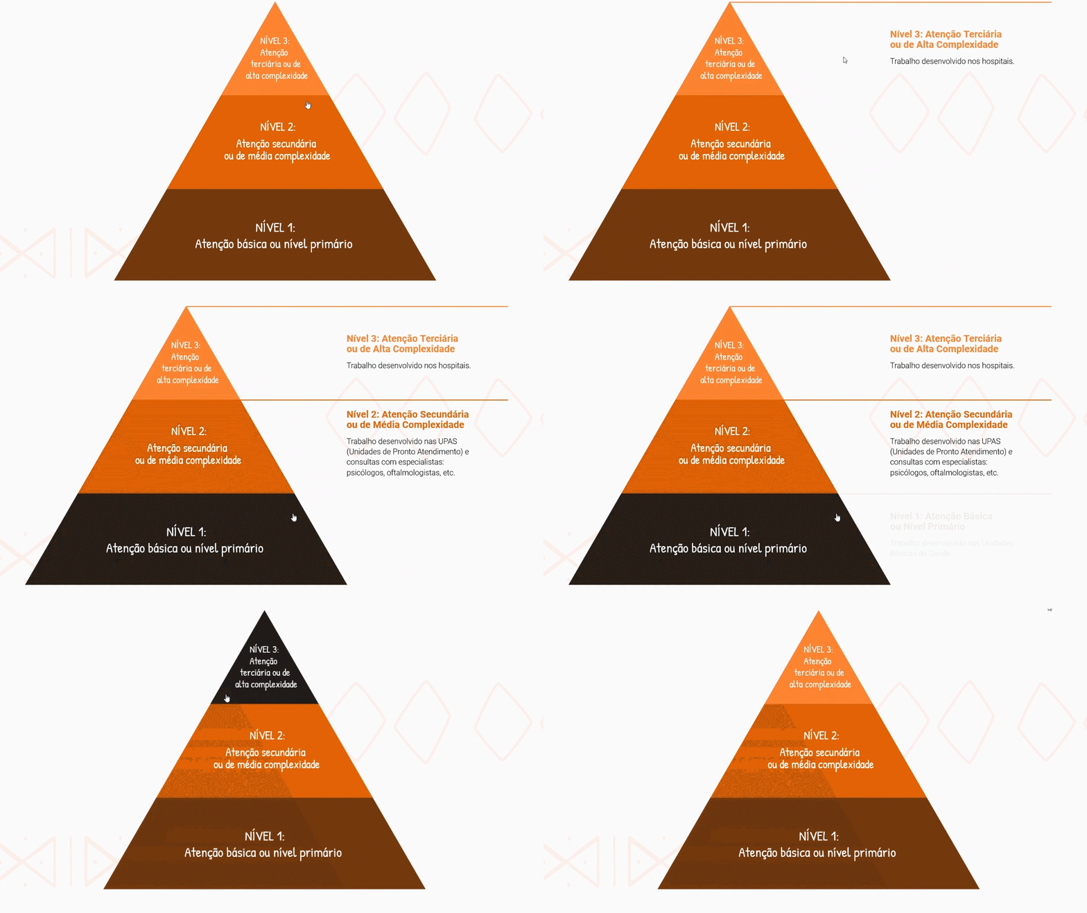
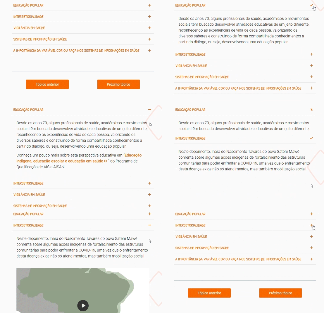
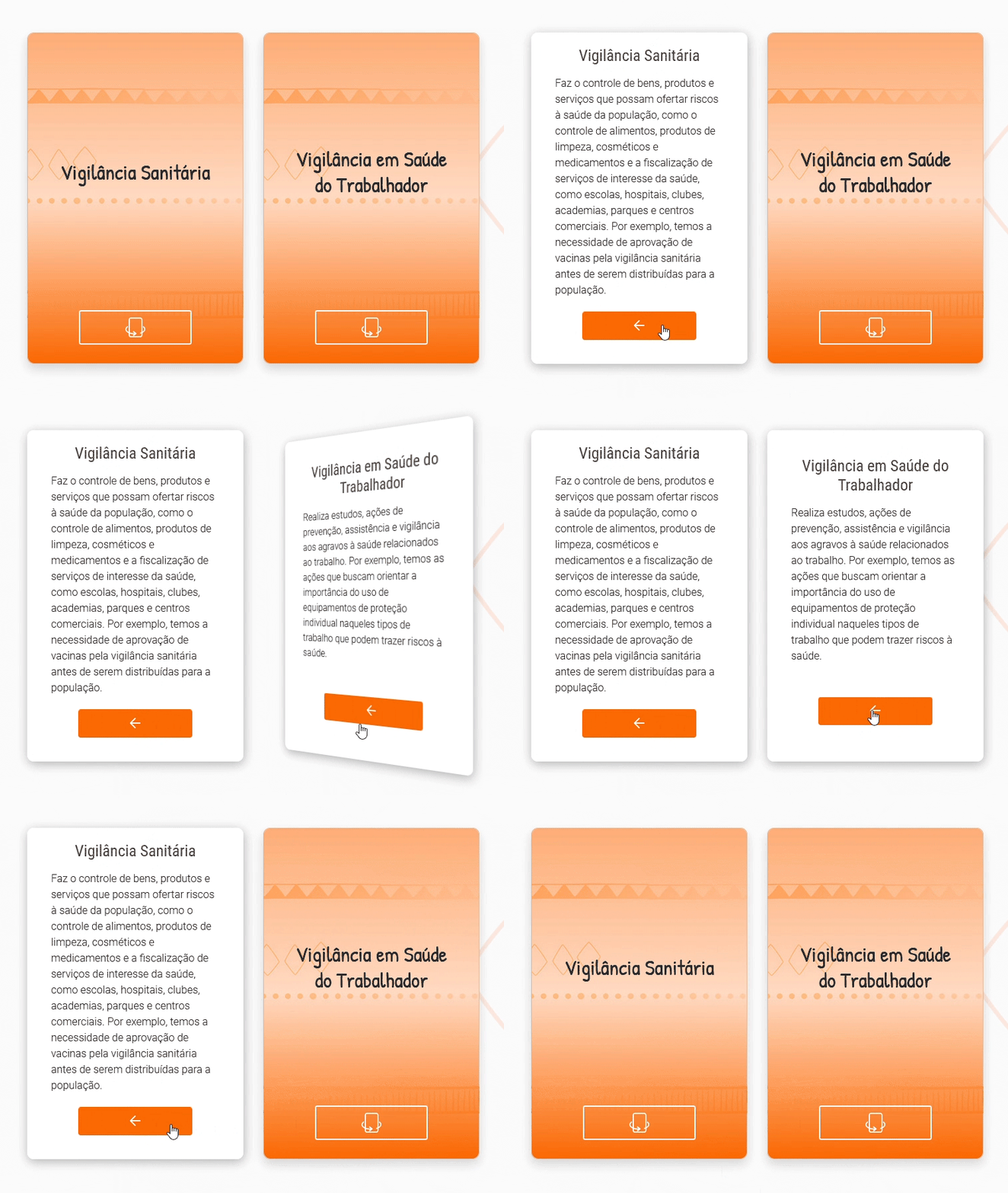
- 📉 Reduce information density on the screen - accordions, tabs, toggles, flip cards...
- ↔ ️Differentiate types of content - cards with icons representing glossary, tips, audios, extra content...
- 🚩 Guide users on something - sliders, timelines...
Our team had to start from the scratch. The first step was to organize a library as a part of the Design System with all the components we could use on the interface to support the educational content. We called it “Educational components”. Each one had an interactive example, the possibility to copy the code, technical specifications and guidelines.

Organizing and documenting: starting out a Design System
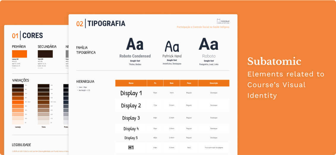
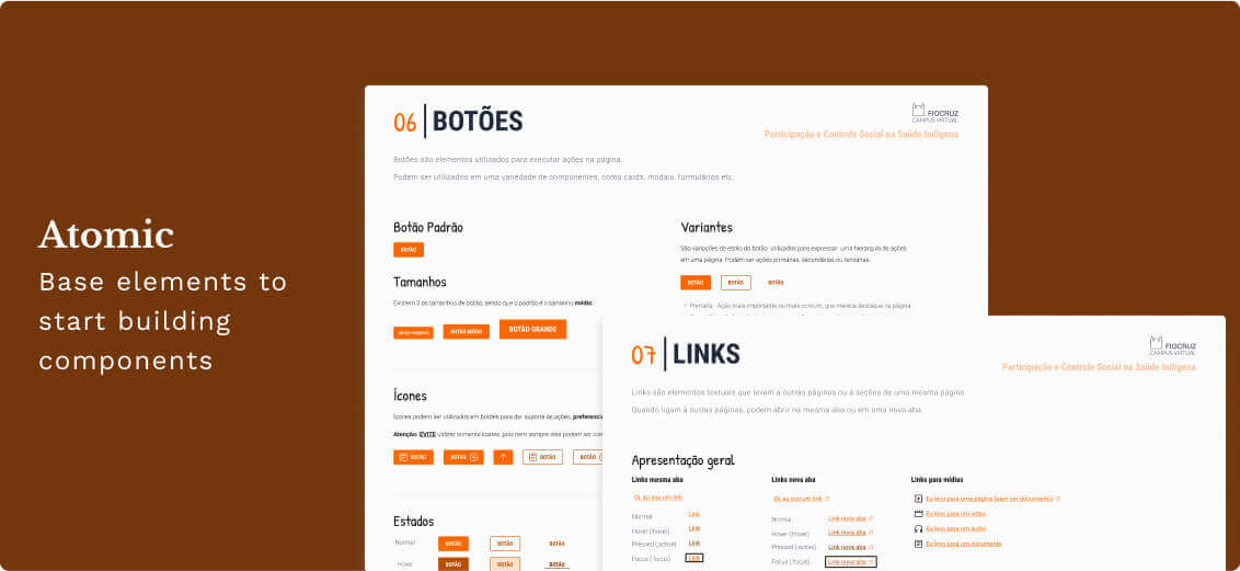
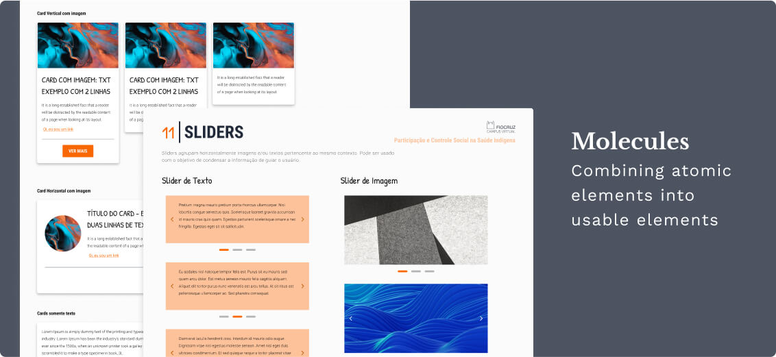
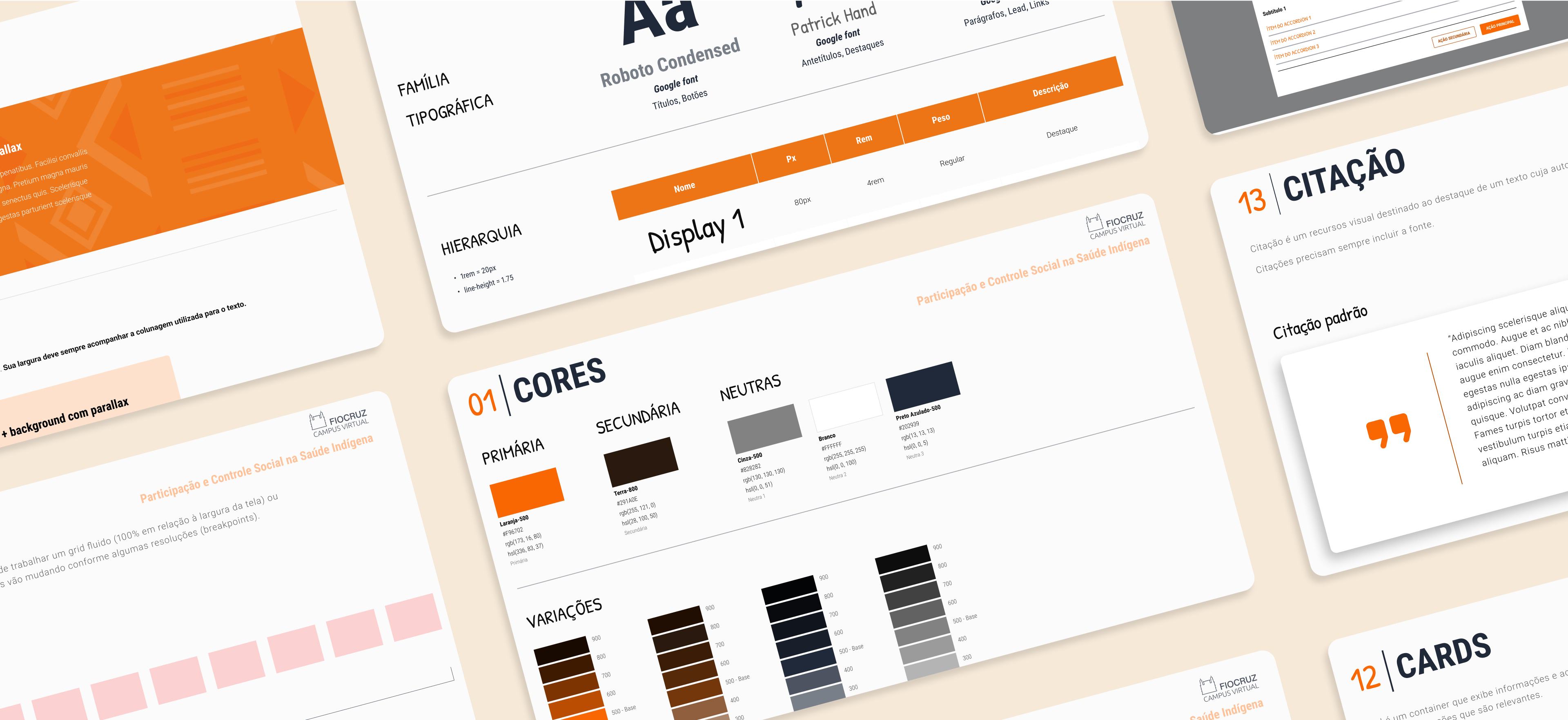
Since FVC produces a lot of courses with in-house employees and freelancers, it's a must to get everybody on the same page as much as possible. We've started building a design system from scratch in Figma. We've presented flexible components, rules and visual identity elements in a way that can be customized for other courses, saving time. We've applied the Atomic Design approach.
Implementing and using in other courses
HTML, CSS, and JS were used to build the template, taking care of accessibility concerns and following the rules of the WCAG as much as possible. We've launched the template and started using it in other courses after some reviews.
