Moodle IFHT/UERJ
Redesigning and improving a responsive platform for a public university's unity
- Client: UERJ
- Role: Lead UX/UI Designer

Context
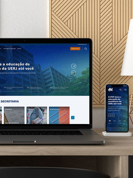
IFHT is a unity inside Rio de Janeiro State University (UERJ) that provides online courses for undergraduate and graduate students, as well as for other public agencies focusing on public policy planning and training programs.
I was the Lead UX/UI Designer of the Design team, which worked together with a multidisciplinary team on eLearning projects.
My challenge was to improve and integrate their institutional website and course platform, consolidating and reinforcing the brand's visual identity.
I conducted user research to find out opportunities for improvements, designed the UI, led the construction of a Design System and implemented the content.
Constraints
- Culture: Low UX maturity & Bureaucracy
- Money: Very limited budget
- Tools: Pre-defined Moodle theme, so we had to consider it's limitations when designing to meet the needs.
Accomplishments
- Saved 30% of time in implementation and turned deliveries more efficient;
- Delivered high-impact courses, fostering partnerships with other public agencies.
Identifying opportunities to improve
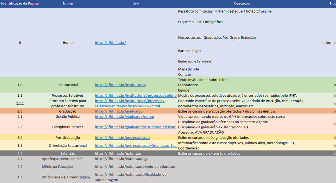
IFHT had 2 Moodles addresses: the first, a older one, for undergraduate students at UERJ and the second one for graduate students and training programs. This division was due to technical reasons, including the server where the environment was hosted by that time. Besides, they also had an institutional website, on a 3rd address, with almost no connection with the 2 previous systems.
The consequence of this choice was a great inconsistency - visually and structurally - making very hard for anyone to realize that everything was produced by the same unity.
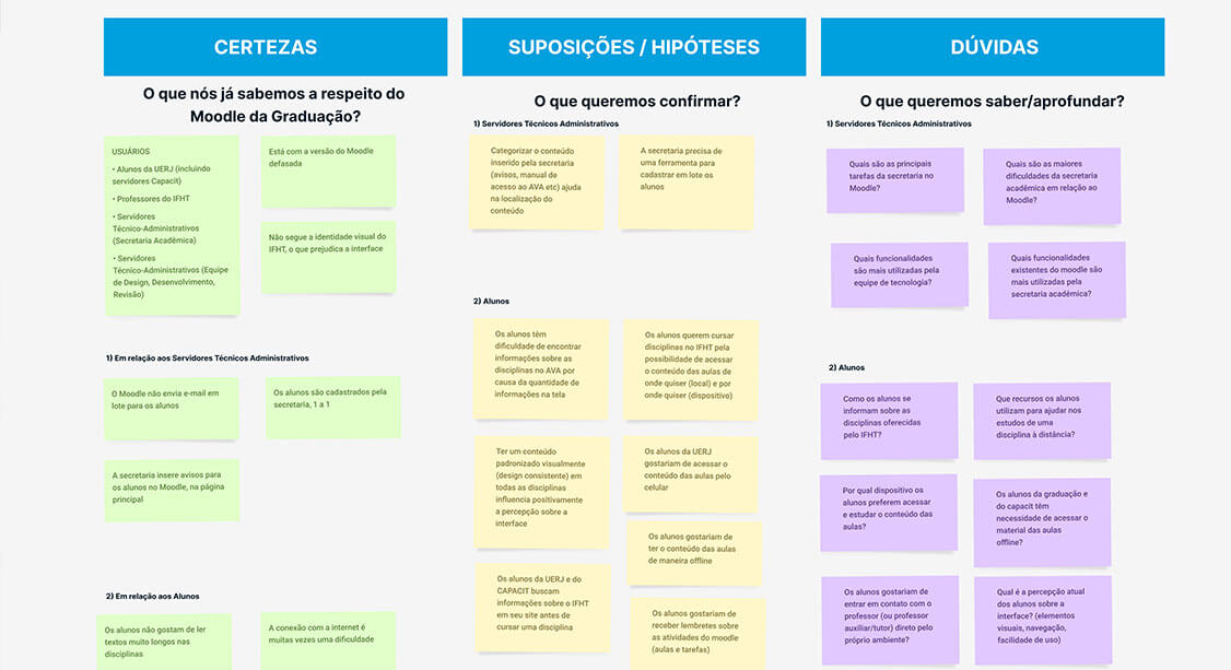
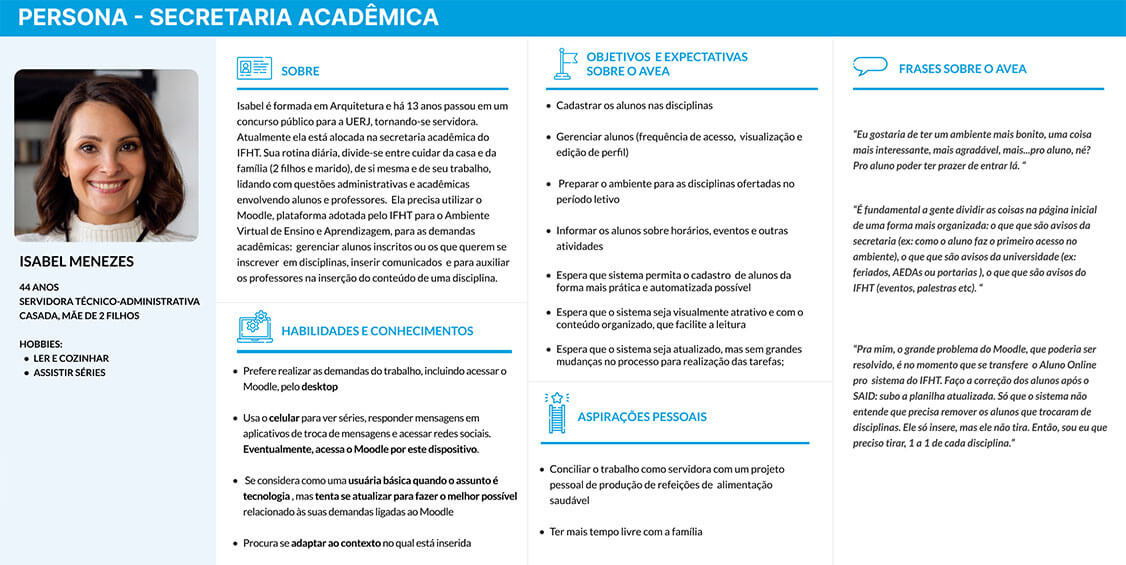
After a 1st approach with the stakeholders, it was clear the need of organizing the house. They pointed out what they expected with this project and I organized a research to understand more the context and frame better the problem: desktop research, user research (remote interviews and online questionnaires), and workshop with stakeholders. These activities generated some documents, which were shared with the teams to put everybody on the same page:
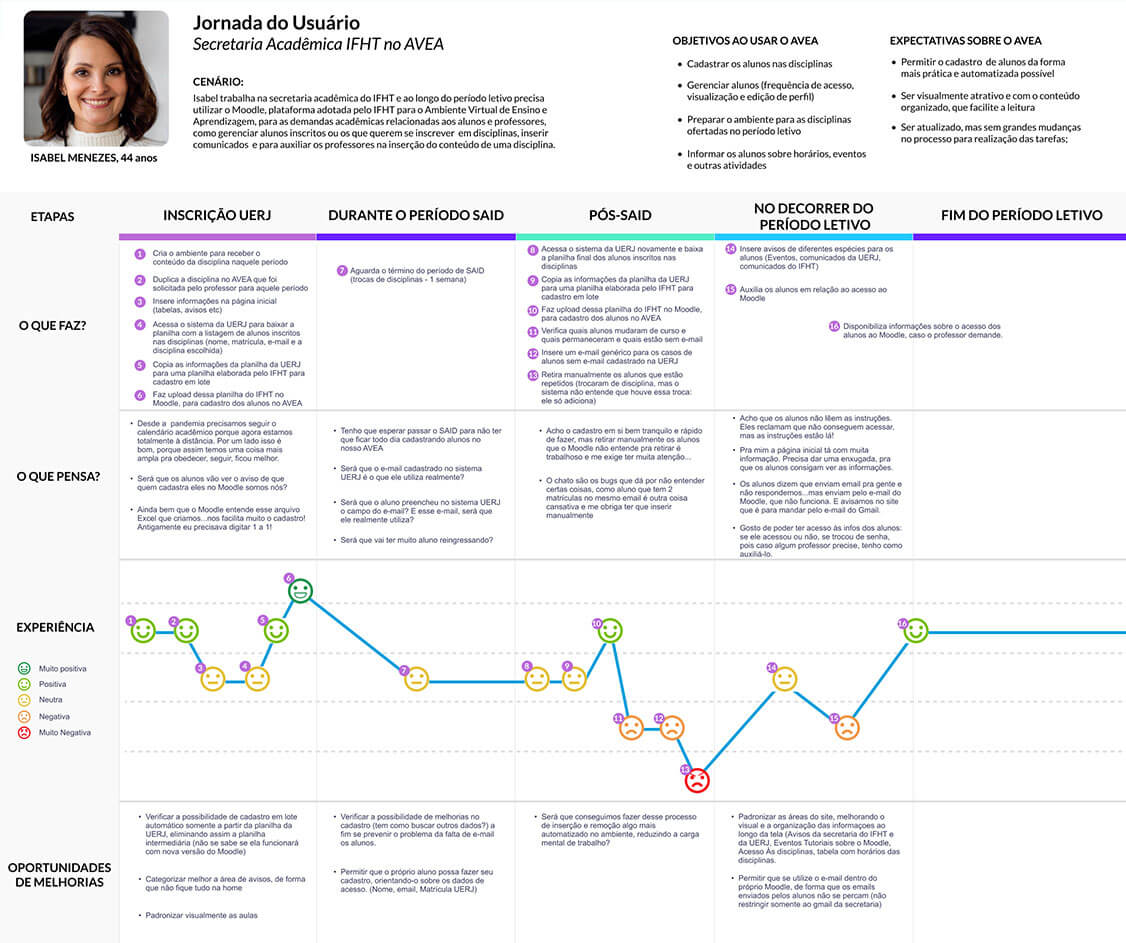
Some Insights:
- 🤯 Students feel hard to find some basic information about the classes and other academic topics on the site.
- 📉 The academic office and teachers struggle to communicate better with students inside the platform: they fail to see the notices.
Validating the navigation and organization of the content on the pages
One constraint was the manager's decision of using a Moodle theme, which was already bought and we had to consider this. Besides, as we had very few back-ends available to work on this project, we couldn't step in totally on templates in order to optimize to IFHT's needs: instead, we had to adapt as much as possible.
This is the real-life design: follow the rules and play with the tools that we have in a given context. It's no magic!
Given this, the Design team started to build a medium-fidelity interactive prototype with the content we received and also some suggestions based on data gathered. At this point we wanted the stakeholders to pay attention only on the structure (content organization and navigation). We've applied elements in the interface in order to meet some of the needs we've found in the Discovery stage and validated them with the stakeholders before working on the visual design.
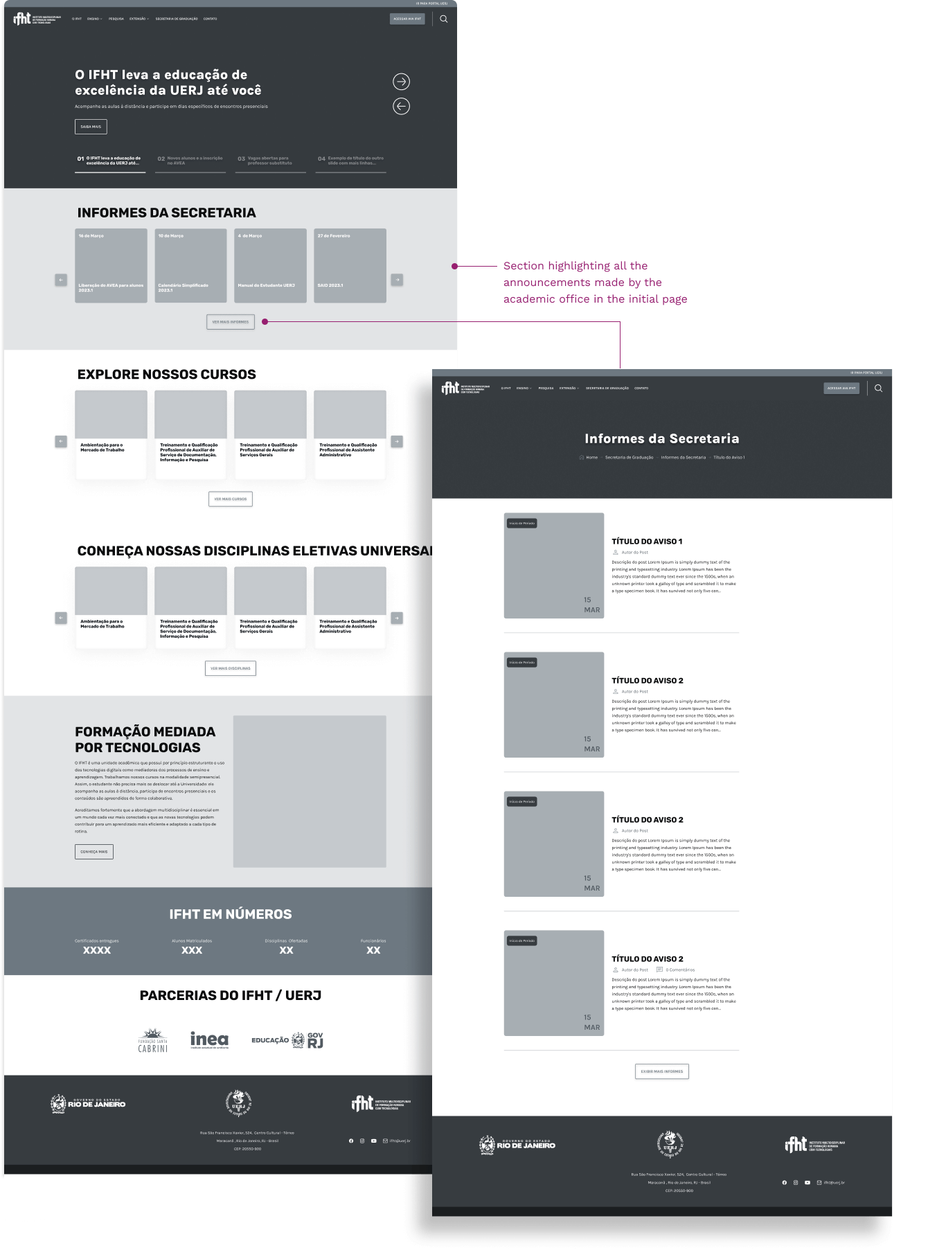
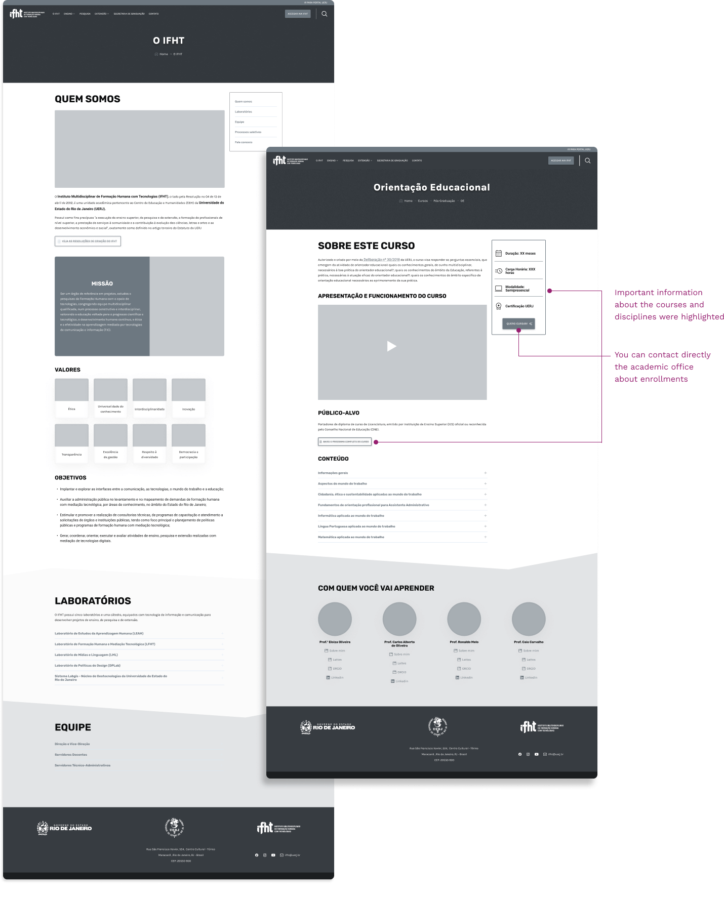
Working on the Visual Design
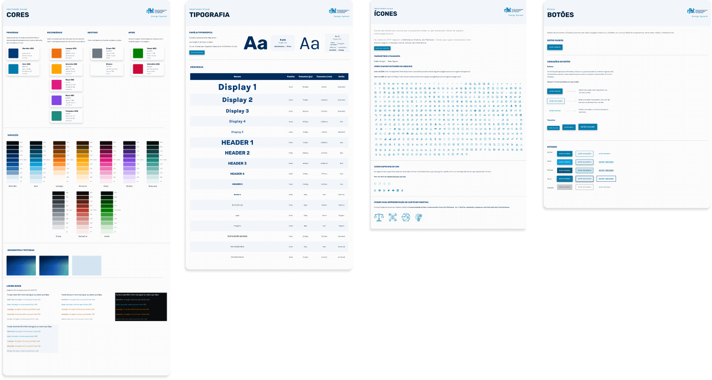
We based our visual design on IFHT's brand colors - shades of blue. These were the primary colors applied in central elements of the interface. We added secondary colors to give contrast with the primary palette and should be used punctually in secondary elements; neutral colors for shadows and backgrounds; and support colors for alerts and other kind of feedback. We also checked some color combinations regarding legibility, considering WCAG AA level. The typography families chosen were Google Fonts Rubik, for headers, and Karla for paragraphs and display text, both open source and with good readability and contrast. Icons were from Flaticon library.
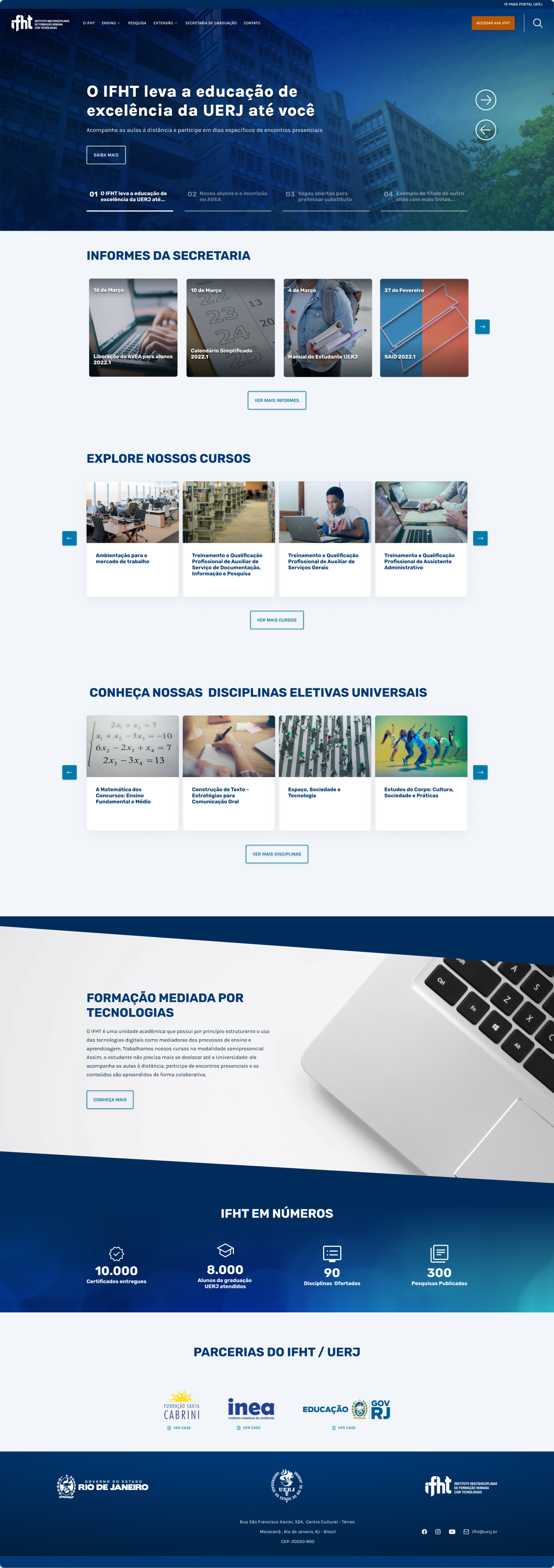

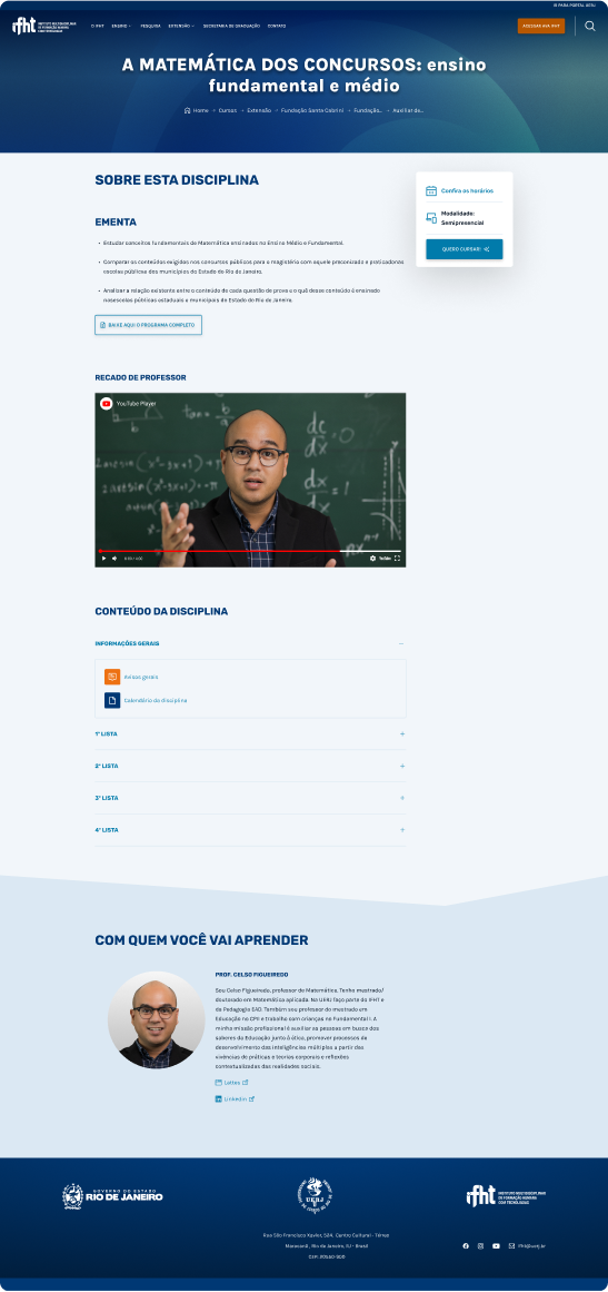
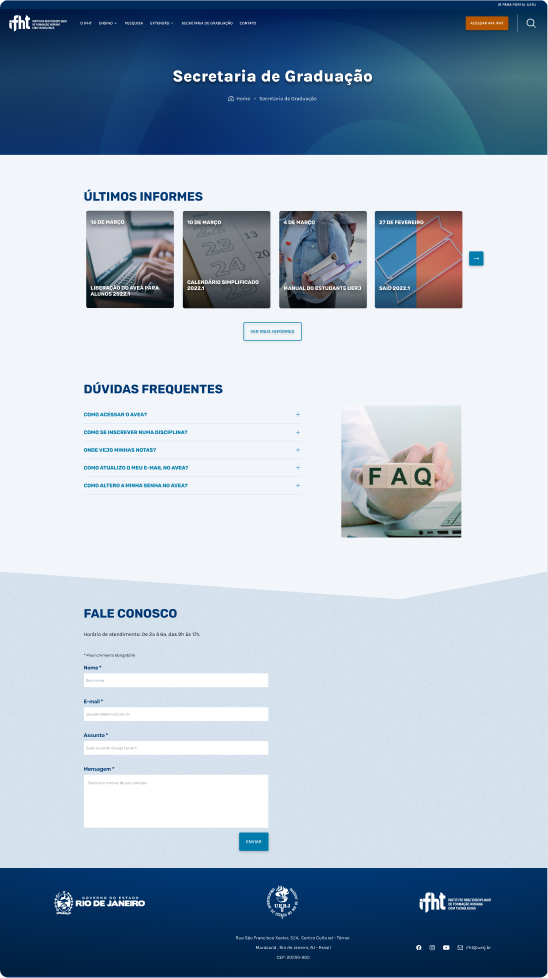
Mobile version:
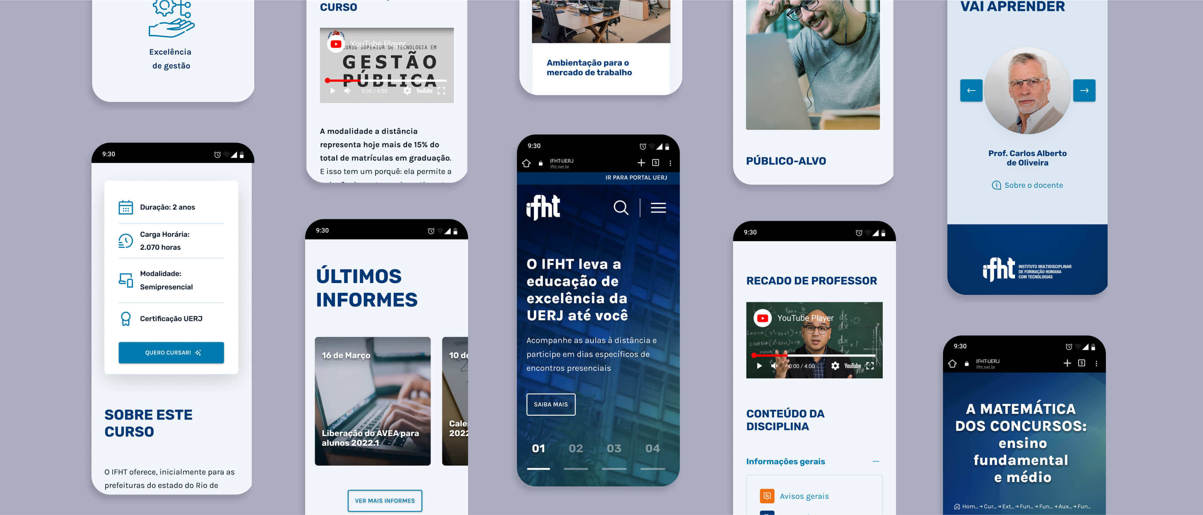
Building blocks library for educational content implementation
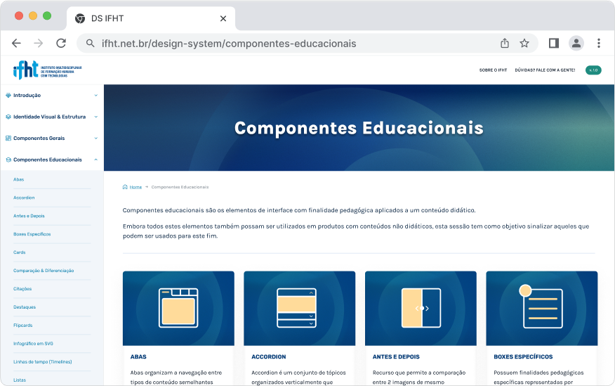
In the IFHT context, the Design team is also responsible for implementing a variety of content related to the classes with a tight deadline. They didn't have nothing documented or organized that could help the designers and other teams, resulting in not consistent or accessible solutions.
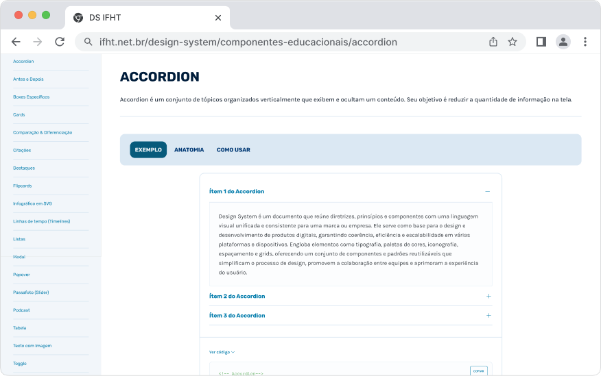
Our team had to start from the scratch. The first step was to organize a library as a part of the Design System with all the components we could use on the interface to support the educational content. We called it “Educational components”. Each one had an interactive example, the possibility to copy the code, technical specifications and guidelines.
Next Steps
The evolution of this project includes:
- Continuity in the design system's construction, including visual identity aspects and best practices, to improve documentation
- Design a new dashboard to present more learning analytics